
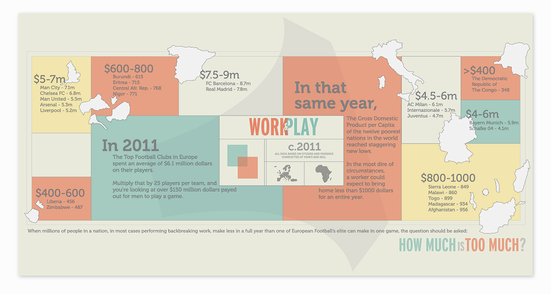


An infographic series examining the difference in wealth between the 20 richest football clubs in Europe and the 20 poorest nations in the world. Utilizing different styles of data visualization, the idea was to show that no matter how the info is presented, the raw data remains the same